Showing posts with label Space and Environment. Show all posts

Monday, 25 November 2013

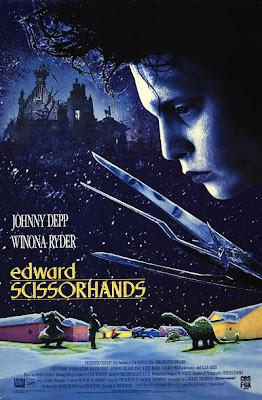
Film Review: Edward Scissorhands

https://blogger.googleusercontent.com/img/b/R29vZ2xl/AVvXsEgv6uT7aYNZbIqarXsfEbaeGXiY-hd8blNwMHVoiz0tYsPgy0-4nWZEUjLklnj2V4MOduis6yi91QHoxWTuNwrBeGFb_8o7BCf3hqv-Tto5gpFacYp4YF0EiLIpj6Xdd_dpmVPME8fX8Ts/s1600/ES+poster.jpeg
(Fig 1, Edward Scissorhands, Poster)

 Tim Burton's film Edward Scissorhands (1990) was one of his most renowned films with lead actor Johnny Depp playing Edward. Edward Scissorhands  could be argued that it gave you an insight into the world of Burton's childhood. Edward was heavily influenced upon how Burton had felt within his life - the outsider, the misunderstood. Although asperges was not recognized until 1940, according to Helena Bonham Carter had said in an interview: ''I realised he has a bit of Asperger's in him. You start recognising the signs. We were watching a documentary about autism and he said that was how he felt as a child.''( Carter, 2010). The film was created show his seperation from society and showing the world through another perspective. It had created an iconic figure for individuality and to stand out among the crowds through one character alone - Edward. This is one of the most iconic figures of today and has had a huge influence upon the fashion scene and it had all started from a drawing from his childhood (Fig. 2).
(Fig 2. Edward Scissorhand original illustration).


Throughout the film the separation between worlds with Edward and his surroundings is obviously represented through character, but also through scenery too. The film is set in a suburban American town and in the 1950's to 60's. When introduced to the film we are given a one point perspective shot showing the two extreme's of Edward's house and the surrounding area (Fig 3).
https://blogger.googleusercontent.com/img/b/R29vZ2xl/AVvXsEjKwJkqb-mNTcrpc52nPW_8eea9lzkk4jGQ6S_JZlcUFjUmmFQ0e9sGQNFWp7jM0mwmvMNNM6Ia7HrYKEaeNU2PUqmAimEFt2Gqaf3Pci36rIH_Jyyddbt9xkZxn7rtznzX-9bRFa0DVx9L/s320/esc_014Neighborhood.jpg
(Fig 3, Edward Scissorhands, Film still)
Although Tim Burton is not known for one the use of one point perspective, Stanley Kubrick is and known famously for the use of these techniques. As Lauren Davis had said whilst analyzing Kubrick's techniques: ''One thing that makes Kubrick's movies so unusual is his heavy use of one-point perspective, to focus in on a single character or object, and often to create a sense that we are trapped within the scene rather than merely watching it.''(Davis, 2012). Furthermore this could be argued that we as an audience are trapped within the scene and feeling the emotions that Edward is feeling. Not only is Edward physically trapped within the castle and 'locked' away from the outside world but he is also emotionally trapped inside a body that no one understands, as an audience we are given that understanding which therefore allows us to relate to Edward. 

Altogether throughout the film there seems to be a constant clash between the two opposites, even in the times where he is accepted as part of the 'normal' community he is seen as being used for his abilities rather than being acknowledged for who he is. This was a film which Tim Burton wanted you to see through his eyes in a fantasy environment. With the fantastic set design and character development you can clearly see Tim Burton had payed close attention to all the little details to get across this complexity of messages for the audience to embrace.


Bibliography:

(Carter, 2010), Mr and Mrs Mad Hatter, Daily Mail [Article]. URL:
http://www.dailymail.co.uk/tvshowbiz/article-1253885/Mr-Mrs-Mad-Hatter-The-strange-world-Helena-Bonham-Carter-Tim-Burton.html (Accessed 25.11.2013)


(Davis, 2012), How obsessed was Stanley Kubrick obsessed with one point perspective? [Online Blog], at URL: http://io9.com/5939802/just-how-obsessed-was-stanley-kubrick-with-one+point-perspective-watch-this-video-to-find-out (Accessed, 25.11.2013)

Illustration list:

Fig 1, Edward Scissorhands (1990) [Poster], URL: https://blogger.googleusercontent.com/img/b/R29vZ2xl/AVvXsEgv6uT7aYNZbIqarXsfEbaeGXiY-hd8blNwMHVoiz0tYsPgy0-4nWZEUjLklnj2V4MOduis6yi91QHoxWTuNwrBeGFb_8o7BCf3hqv-Tto5gpFacYp4YF0EiLIpj6Xdd_dpmVPME8fX8Ts/s1600/ES+poster.jpeg (Accessed 25.11.2013)

Fig 2. Edward Scissorhands (1990), Original illustration [Illustration], at URL: http://www.stylenoir.co.uk/wp-content/uploads/2011/06/Edward-Scissorhands-tim-burton-original-illustration.jpg (Accessed on 25.112013)

Fig 3. Edward Scissorhands (1990), Directed by Tim Burton, [Film Still]. at URL: https://blogger.googleusercontent.com/img/b/R29vZ2xl/AVvXsEjKwJkqb-mNTcrpc52nPW_8eea9lzkk4jGQ6S_JZlcUFjUmmFQ0e9sGQNFWp7jM0mwmvMNNM6Ia7HrYKEaeNU2PUqmAimEFt2Gqaf3Pci36rIH_Jyyddbt9xkZxn7rtznzX-9bRFa0DVx9L/s320/esc_014Neighborhood.jpg. (Accessed on 25.11.2013)


Film Review: La Belle et la Bête


(Fig 1: La Belle et la Bête Poster)

La Belle et la Bête is a french film in black and white directed by Jean Cocteau. It is an adaptation of a classic children's story by Mme and is well known as the Beauty and the Beast. As said by Michael Wilmington in his review, ''This is a poet-painter's film. In a glistening landscape that suggests Dutch paintings come to life.'' (Wilmington, 2002). On first sight this film looks incredibly stylized with its stunning production design.
http://theredlist.fr/media/database/settings/cinema/1940-1950/beauty-and-the-beast/023-beauty-and-the-beast-theredlist.jpg
(Fig. 2: La Belle et la Bête, Production Art)


(Fig 4, La Belle et la Bête, film still)


The film is highly influential from the original production art created for the sets as you can see in Figure 2. Cocteau had commended Beard on his influence upon the film as they worked together and from the concept and production art you can see a direct correlation to the costumes, lighting and the interior of the beast's castle. The film itself represents the artists visions when designing the sets with the gleaming white curtains and overall design of the house.

Produced in 1946 after World War Two this was hugely success with it's sense of escapism for the audience as this allowed the audience to break free from the reality of their tragedies and indulge themselves in a magical land. This was said in a written review by Frocktalk,“La Belle et La Bête is a soothing balm of a fairy tale, engendering hope in the promise of new beginnings and restoring faith in the compassionate spirit of humankind. It is a story about breaking free from imprisonment and breaking forth into freedom. It was a message that people needed to hear then''(Frochtalk, 2009). This can be seen in the film where Belle falls in love with the beast after being 'imprisoned' by him but this also gave her a chance of a new beginning with a better life. 

(Fig 5,La Belle et la Bête, Film still)


(fig 6, La Belle et la Bête, Film still)


To help this sense of escapism within his film, Cocteau wanted to produce something out of the ordinary. This is shown with statues that are living and breathing (Fig 5) and candles being held with prosthetic limbs (fig 6). It is clear that he had put a lot of thought into each element: set design, costumes, plot etc. Altogether this is a film with great designs and a very strong underlining meaning to the film that was highly thought about at the time of production.


Bibliography:

(Wilmington, 2002), La Belle et la Bête film review. URL: http://articles.chicagotribune.com/2002-09-06/entertainment/0209060033_1_beast-josette-day-magical. (Accessed on 22.11.2013)

(Frocktalk, 2009) La Belle et la Bête film review. URL: http://frocktalk.com/?p=1520
(Accessed on 22.11.2013)


Illustration List:

Fig. 1: La Belle et la Bête Poster Art (1946), From: La Belle et la Bête, directed by: Jean Cocteau. [Poster] At: http://theredlist.fr/wiki-2-20-777-786-view-1940-1950-profile-1946-bbeauty-and-the-beast-la-belle-et-la-bete-b-j-cocteau-c-berard-l-carre-r-moulaert.html(Accessed on 22.11.2013)

Fig. 2: Drawing by Christian Beard (1946), For: La Belle et la Bête, directed by: Jean Cocteau [Drawing]. At: http://theredlist.fr/media/database/settings/cinema/1940-1950/beauty-and-the-beast/023-beauty-and-the-beast-theredlist.jpg (Accessed on 22.11.2013)

Fig. 4.  La Belle et la Bête film still (1946) From: La Belle et la Bête, directed by: Jean Cocteau. [Film Still] At: http://dudummesau.com/2011/09/11/klaus-kinski-call-me-beast/ (Accessed on 22.11.2013)

Fig 5,La Belle et la Bête, Film still (1946), From: La Belle et la Bete, directed by Jean Cocteau. [Film Still] At: http://www.gwarlingo.com/2012/jean-cocteau-beauty-and-the-beast/

Fig 6,La Belle et la Bête, Film still (1946), From: La Belle et la Bete, directed by Jean Cocteau. [Film Still] At: http://www.gwarlingo.com/2012/jean-cocteau-beauty-and-the-beast/


Sunday, 17 November 2013

Secret Lairs: Thumbnails (28-31)


After watching Feng Zhu's most recent video it had inspire me to go back to the line drawing approach when designing my lair. Therefore I started these series of thumbnails with a line drawing then onto value range in black and white using four values and then applying colour on top of them. I worked on three simultaneously so I wasn't too precious with my paintings and approached them as designs rather than finished paintings.

After completing the three designs I turned off the line work to see if they are working as a painting and as to a surprise they were starting to take shape, I especially like the portrait painting and the blue landscape. Following from these I will do an environment prop sheet, and a hero prop sheet so I can finalize the design on the shrine/grave tomb of the king and the surrounding area.

I felt as though I had more control over the whole scene when designing with the perspective grids and drawing lines as compared to blocking out environments, it's an approach which I shall use in  the future, although I need to work on my draftsmanship and line quality for it to really benefit me later on.


Thursday, 14 November 2013

Colour Thumbnails Lair Designs 1


Starting to incorporate colour within my thumbnails now to set the mood of the scene. This exercise was quick 30min-45min studies focusing on colour and atmosphere. Design wise I was thinking , tall pillars inside of the cave to give it more of a cathedral structure. The lair is still going to be a holy place, but with the shrine of the queens husband as the place of worship. I chose this  because I have decided to change the narrative being:  ''king Phruox, has given his soul to mountain and it is believed that his spirit is what is stopping the walls around them from caving in''.

I think I will have the shrine lit up with candles by its feet, and to have some other lights hanging from the pillars to help light up the scene. I'm having a bit of trouble with the background of the piece and still unsure how to paint that into the scene but by doing these more I think it will help my design development  and it will help especially with the use colour :).

Monday, 11 November 2013

Seceret Lairs: Thumbnails (19-24)


After speaking with Jordon I had decided to experiment with the idea of the room being the kings burial site where the queen would be buried as well, being one of the most sacred grounds within the mountain. I looked in the tombs in Lord of the Rings, and temple/cathedral architecture to incorporate within my design of the interior of the mountain. I've decided to stay away from the rock idea as the mountains will be full of rocks also. Therefore I can start to explore the designs of the catacombs within the mountain where the royals are buried.


Secret Lairs: Influence Maps 2


Following from the OGR I realised that I have been designing the interior of the whole cave in the mountain rather than the lair room itself. So I have decided to do more research in ready for our photoshop lesson today. I am still thinking along the lines of a holy stone/stone structure (Neolithic) used to contact the gods and to have a light encription on it when the ritual takes place. To make the place seem more holy, I was thinking along the lines of using stone pillars like you would see in a temple. When researching I also had colours in mind, I was thinking using a main blue light as the key light to give the place a magical element to it.

I still think the environment is lacking the royality element. To tackle this I think I will use the hero prop being a crown design that is used for contacting the gods. Although I feel it would still need more royality representations. I think to do this by designing some hanging lights that have rich designs in them to help with this problem, this will also give us our light source.


Wednesday, 6 November 2013

Secret Lair: Thumbnails (10-18)


Exploring to see what inside a mountain would look like, I want this place to be a holy place where the queen would go to seek the elder people who can speak to the gods, much like the scene in 300 when he climbs up the stone structure to speak to the oracles.

Tuesday, 5 November 2013

Secret Liar: thumbnails (0-9)


I saved them! :), Here are my first 9 thumbnails about my lair. I was thinking about a central tombstone that is huge in the center of the cave/tomb. The light coming from it I was thinking maybe a the sun light coming through the top of the cave, and maybe having some water in the cave to give it a sense of holiness. Also rivers start at the top of mountains  so this could be the area where the river starts from, hence the water inside of the tomb.

Secret Liar: Influence Maps


Here are my three influence maps for my secret liar of the Neolithic Queen. I had an idea for the liar to be a sacred burial site where the people of the Chachapoya's would bury their royals. At first I was thinking of a  throne room, but I wanted to stay away from the obvious and make more of a worshiping place. I have decided to make my queen from the Chachapoya's in peru as they are a very interesting, they lived in the mountains and carved their own tunnels and rooms into the mountains.

I had done some thumbnails in Jordon's class yesterday but I can't seem to get the file to work, hopefully I'll be able to get them working later :(. Some thumbnails will be up later on though :)

Wednesday, 30 October 2013

Space and Environment Project 2: Secret Lairs


The Secret Lair of the... 

'Neolithic Queen'

Neolithic: ''relating to or denoting the later part of the Stone Age, when ground or polished stone weapons and implements prevailed.''
Queen:'the female ruler of an independent state, especially one who inherits the position by right of birth.'
This could be a very interesting project combining the both :)  


Pre Secret Lairs: Thumbnail Practice


In Jordon's Photoshop lesson on Monday we were given a short amount of time around 15 minutes to gather research and do a page of thumbnails for them specific topics that were given, them being: Steam Punk Explorer, Candy Land Huntsman and Gaelic Golem. This was an exercise that I am going to use for my idea to generate my thumbnails when looking at my own Secret lair. I dont think I will work straight into colour as this took the most time and I feel when thinking about colour that requires a whole other day to get the right palate for your scene.

Still Life: 23.10.2013

 Paintings using the inks in the still class. It was a relaxing exercise to do whilst having a hectic week of work to do for the crit last Friday :). Had been meaning to post these for a while sorry!


And the some photos of the installation that we had to paint.


Thursday, 24 October 2013

Third Scene: 'The Pit'


This is my final painting ready for tomorrow and the process involved. This one was very tough as I am more comfortable in an organic environment but overall I am kind of happy with this one, the green bit on the left is suppose to be a piece of material could be from a flag of some sort if you were wondering :)

Early Thumbnails for The Pit


The above are the early thumbnails I did for The Pit and the Pendulum at the begging of the project.

Perspective exercises just figuring out how different forms would be in 1, 2 and 3 point perspective.


These were some quick thumbnails for the Wednesday environment that I did :).