Showing posts with label Secret Lairs. Show all posts

Friday, 13 December 2013

Film Review: Black Narcissus


Black Narcissus
http://www.doctormacro.com/Images/Posters/B/Poster%20-%20Black%20Narcissus_01.jpg
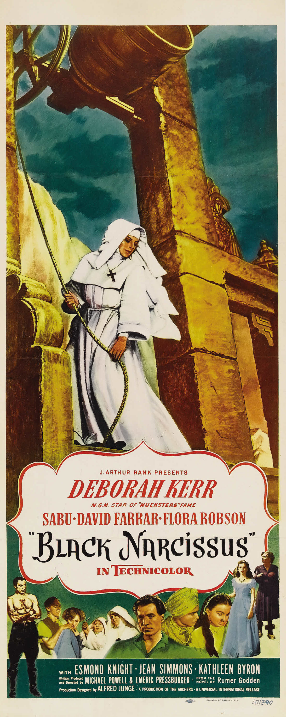
Fig 1


Black Narcissus (1947) is a British film directed by Michael Powell and Emeric Oressburger. The script was adapted from a novel written by Rumer Godden. The use of the paint over technique on glass is extremely impressive and realistic and convince the audience that you are within the scene, even though it was filmed in studio's. When looking at the production design for this scene Michael Howelles had explained how they use the matte painting effect to create realistic sets, ''“The glass painting technique involved hanging a sheet of glass between the camera and the scene, and painting in the view you needed.” (Howells, 2011). Similar techniques had been used in earlier films such as the original King Kong and began to make it's way into this film too. As you can see in figure 2 this technique had created very believable sets that were only paintings on glass. Colour had played a vital role within the film with the colour red becoming more vibrant over the course of the film. 


https://blogger.googleusercontent.com/img/b/R29vZ2xl/AVvXsEhOXvGBAptWxIHrzg2vMsa5JagQNY7F5jiUkIqwRQXpYbyvuQ6K2o1Cq31TpCdyrzH3d48c6_fzQzzowpq7FPhDRyq1A8J_5ZhW2Vbg-RYq6_Xi1jQGoXOGr1sNFDYML_XXaRNWE83qY-U/s640/black+narc1.jpg
Fig 2
 

After the half way point of the film it is apparent that the colour red is starting to overcome the scene. This notion of red becoming almost a 'fever' is described by Michael Mirasol in his film review, '' But it is in the second half of the film where Powell's use of Technicolor is stunning. The introduction of the more vibrant hues dominate the film. The use of red is feverish'' (Mirasol,2010). In figure 3, you can see the indian girl is the first to introduce the red into the colour palette representing love and lustre, everything a nun shouldn't be. But later on in the film Sister Ruth finds herself wearing a completely red outfit similar to the picture,after that it seemed as though the nun's were  suffocated with the overpowering red colour palette, with tightly fitting red dresses and red lip stick both classic signs of love and sexuality and a complete opposite of how nun's are.
BlackNarcissus3-793947.jpg
Fig 3


Although red is a symbol of love, it is also a symbol of danger and this film could categorized as a horror film with it's unearthly sets, howling winds and the sisters slowly losing their sanity.  As Keith Uhlich says in his review; "There's something truly unearthly about this place of howling winds, yawning chasms and atmosphere thick with temptation." (K. Uhlich, 2012) this is what most contemporary audiences recognise with this film. Although it is not structured like most horror films, it is very slow but as the film goes on to when Ruth becomes over powered by lust the film turns a lot more dramatic and then you can feel the tension between the characters.

Overall this film is a great experience and the use of matte paintings can make the audience believe the scene is real without having to shoot the scene in a specific location. You can see the influence the artists had on this film also with the use of red flowing into the scene's to give the sense of love, sexuality and danger towards the characters. 


Illustration List

Fig 1. Black Narcissus Poster (1947) From: Black Narcissus - Directed by: Michael Powell & Emeric Pressburger


Figure 2 Behind the Scenes – Matte Painting [Still Image] at https://blogger.googleusercontent.com/img/b/R29vZ2xl/AVvXsEhOXvGBAptWxIHrzg2vMsa5JagQNY7F5jiUkIqwRQXpYbyvuQ6K2o1Cq31TpCdyrzH3d48c6_fzQzzowpq7FPhDRyq1A8J_5ZhW2Vbg-RYq6_Xi1jQGoXOGr1sNFDYML_XXaRNWE83qY-U/s640/black+narc1.jpg (accessed on 13/12/2013)


Fig 3, Black Narcissus [Film Still] from: Black Narcissus - directed by Michael Powell & Emeric Pressburger. At: http://www.rogerebert.com/far-flung-correspondents/black-narcissus-which-electrified-scorsese (Accessed on 13/12/2013)


Bibliography


Mirasol, M. (2010) Black Narcissus Review


Howells, M. (2011) Production Design in Black Narcissus

K. Uhlich (2012Black Narcissus Film Review (Accessed on 13.12.2013) 
 

Thursday, 12 December 2013

Secret Lair: Final Render


Just so there is no confusion, this is my final render of my secret lair :)

Secret Lairs: Character Bible

Secret Lair: Hero Prop and Set Orthographics


Secret Lairs: Creative Partnership Archive


I thought I had commented more than this, I may have missed a few, but I see everyone from day to day and advise them and help them on their project so I think this is why I don't have much of an online presence as it appears from the lack of creative partnership comments. Even though I said this last project, I need to start commenting on more people's work outside of the class room so I have an archive as appose to not having much in the archive.

Secret Lairs: Production Artists (Who is Who)

Secret Lair: Build up

Secret Lair: Crit Presentation

Secret Lair: Final Renders


Final renders of my lair, overall I'm pretty happy with the result considering thisis my first maya attempt and modelling an interior :)

Secret Lairs: Disk Art Work

Wednesday, 11 December 2013

Secret Lairs: Progress... UV's and texturing


Finished laying out my UV's on my scene and started to texture my scene. I also increased the lighting I will go back once the textures are painted in, and then 'pump' them up a bit more and play with the contrasting oranges and blues. I was playing around with the floor and still unsure how to make it work, the plain text and puring (First one) seemed too genericlain so I decided to make a plain with a 3d texture and then used a displacement map to give it depth within the image, I think this is working better however it still needs some work. Also included using a bump map on the walls to make it feel more 'cavy' and 'rocky'.

Tuesday, 10 December 2013

Secret Lair: Basic Lighting Set up


Experimenting with the basic lighting set up seeing how dark I want the scene to be and seeing how the distance on the ambient occlusion node effects the scene. It seemed to of made everything mid grey at first but by increasing the distance I feel it has given the image more depth. Now onto texturing and I can tweak the lighting later on when I am texturing. I had a pink light source under my font in my concept art but I'm not 100% sure how I would do this, so I will experiment with that later on. Any advice for this scene would be great :).

Monday, 9 December 2013

Secret Lairs: Lighting set up - beginning


Experimenting with the lighting set up, these are my first couple of renders and my final composition that I am going to work with. I need ot capture the essance of the light blue and the warm candle lighting therefore I had an idea of the blue light source coming from the font it self, this will also help with the focal point of the image.

Secret Lairs: Finish Modelling


 Finishing off the modelling for my scene, I need to work on the hero prop and find a way to model the peacock feathers and then onto lighting :)


Friday, 6 December 2013

Secret Lair: Modelling


Beginning of my Maya scene for my secret Lair. I need to make the lair more 'cave like' and explore with the overall structure. Then finish modelling the candles and lights on the wall and finally onto uv texturing and lighting :)

Wednesday, 20 November 2013

Secret Lairs: Online Green Light Review 2


Secret Lairs: Colour comps


Some colour comps experimenting with colour and helping my scene stand out, the original seemed a bit muddy and grey, therefore I wanted to bring in a complementary colour such as blue and a bit of purple in shadows, as blue is a colour of power, this will help the audience to understand that this room is for a queen.

Secret Lairs: Concept art

This is my Lair for the Neolithic Queen, its almost finished I will do a few more colour comps to help in terms of colour. The hero prop is a holy font where she goes to bless each child of birth within the tribe, this is one of many secret rooms inside the mountain where the Chahcapoya people live. I designed the font's surrounding in the shape of a thrown and using peacock feathers to reinforce the royalty of the queen. I wanted to incorporate some hanging cloth's into the scene but unsure whether to or not.

Tuesday, 19 November 2013

Composition Thumbnails: Secret Lair

Thinking of different compositions that can work with my lair with the hero prop being the main focus. I want my hero prop to be a holy water font that is formed on a stone structure (the one you see in the thumbnails). The font will be apart of the stone structure itself. I was thinking to having the stone font structure having a mirror up the top where the sun shines down into the scene leaving an encryption on the floor - a message from the gods. Or perhaps having the encryption light up on the font rather than a projection. I want the lair to be a place of solitude, restoration, holiness, calmness and royalty. I don't want the scene to feel busy, therefore having the encryption on the font light up on would be a better approach.

Monday, 18 November 2013

Secret Lairs: Influence Maps


After speaking with Jordon today I realised I need to start thinking more logically about my work when designing my lair, thinking about its function and why everything is the way it is. Therefore I have started to look at cathedral architecture, church architecture, holy places of worship, religious rituals and symbolism of it being a holy place whilst still thinking about it being set in the neolithic times and still being able to see that it belongs to a queen.

Therefore this requires me to change my hero prop completely, getting rid of the statue and replacing it with a holy font, where she goes to wash her sins away. I want this place to have a calmness to it, with a sense of paradise and solitude, where she can go by herself and be with the gods. 

When thinking about the design of the font and the surrounding area, I have researched into peacocks being a symbol of immortality and is often associated with royalty and queens. I am still setting this inside of the mountain where her father died, therefore mixing these elements with a mountain environment should lead to some interesting outcomes. I will further experiment with composition as suggested by Jordon so I can frame the shot where the hero prop is in a higher position as though you are looking up at it to give a sense of power, once again reinforcing the power of the queen. Although I feel like I've had to re think everything and start again, I feel this is the right way forward.